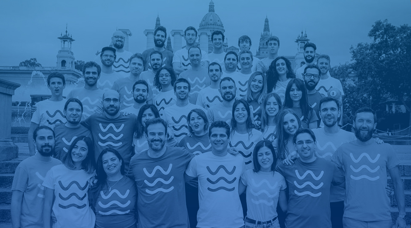
Fluid Identity for HR Software
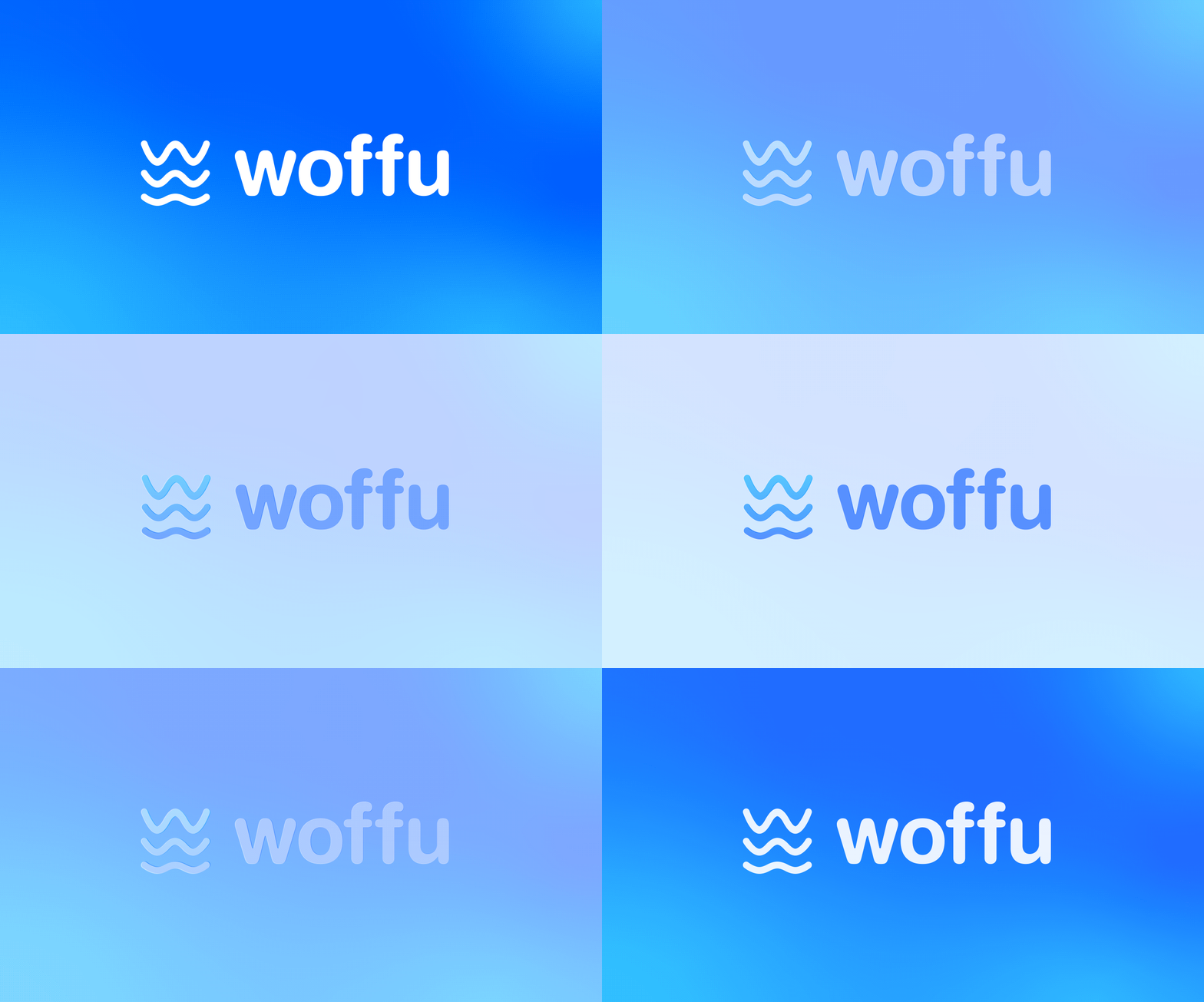
Woffu is a leading Spanish HR platform. To scale in a competitive B2B market, they needed an identity that clearly communicated their "Liquid Work" philosophy: a frictionless approach to employee management.
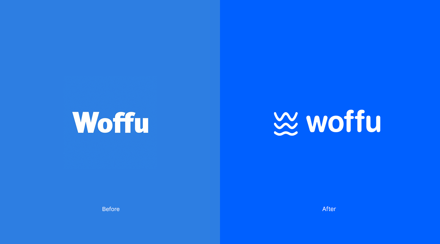
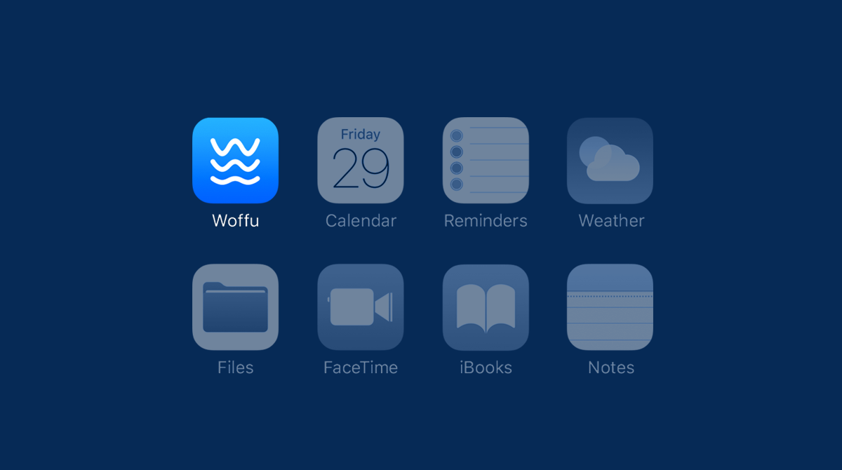
Their previous identity lacked a standalone symbol. To reinforce this positioning, I designed an organic mark reflecting movement and adaptability. This fluid shape illustrates the operational agility companies experience when adopting the platform.

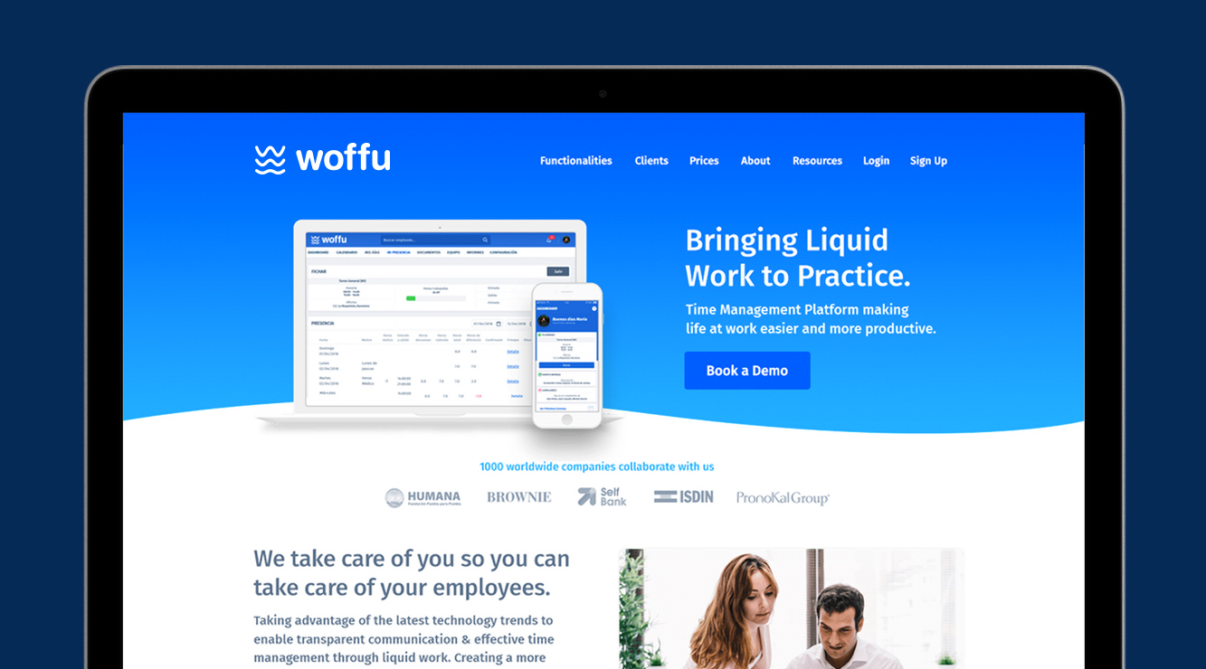
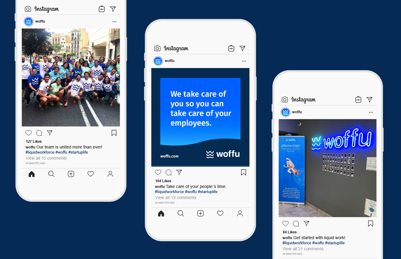
I developed a unified visual system driven by a vibrant blue palette and human-centric typography. This optimized the brand for high-frequency digital interactions and faster user adoption.
This updated visual identity delivered the professional weight necessary for enterprise growth. It supported Woffu during its rapid expansion and eventual acquisition by the tech group Visma.