Brand Architecture for Climate Software
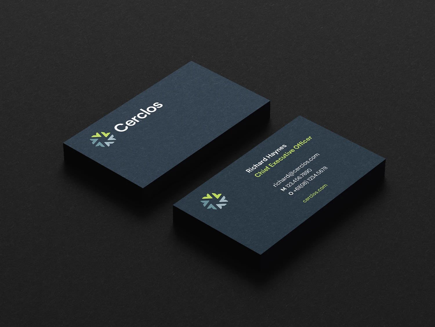
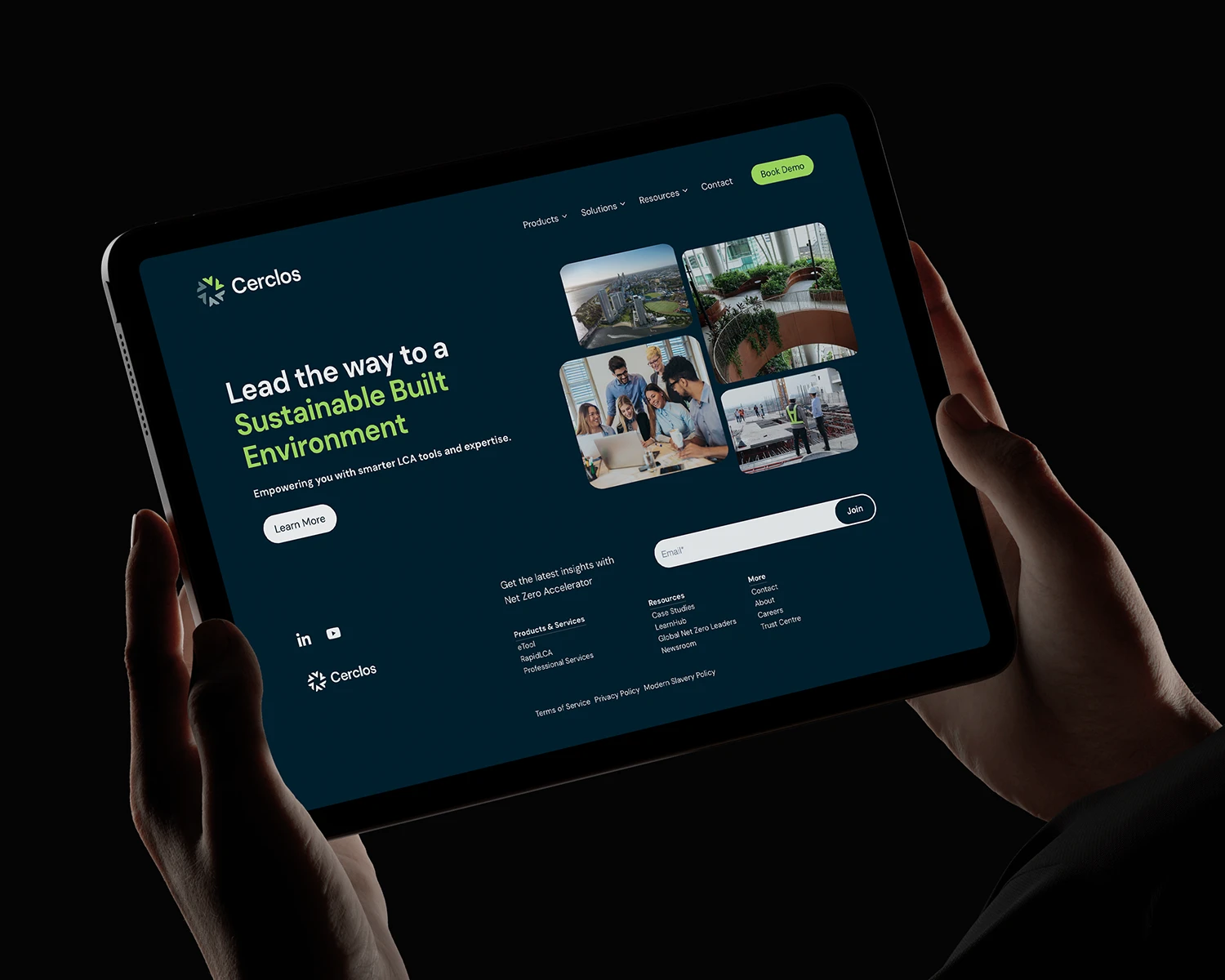
As eTool, a sustainability software company, expanded its product suite, the original brand architecture could no longer support its scale. They renamed the company Cerclos. The challenge was to separate the corporate identity from the software while building an integrated system that unites their distinct products.
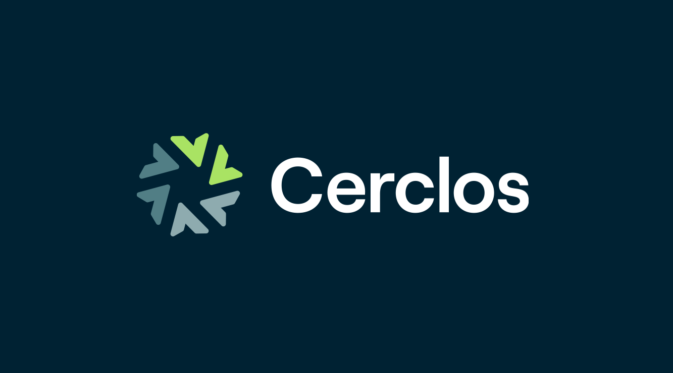
The Cerclos name combines the French cercle (circle) and Greek helios (sun). Guided by this, I designed a modular symbol where directional elements converge into a continuous circle while radiating outward. This geometry acts as a visual translation of their core Life Cycle Assessment methodology.
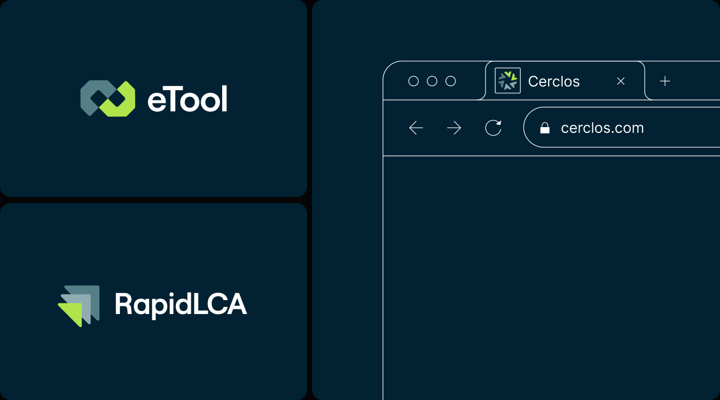
Their flagship carbon management software, now simply eTool, required a distinct yet aligned identity. Built on the parent brand’s geometric logic, the symbol features two components uniting to form a continuous loop. This structure illustrates the ongoing optimization of environmental and cost performance.
For the agile assessment tool RapidLCA, the symbol's construction prioritizes speed. Directional arrows are stacked to convey forward movement. I applied the same visual logic to every entity, building a unified, scalable corporate family.